


Big themes for the week include tech dominance reaching new heights, the “everything reversal” and the biggest IPO in history.
Episode Summary
The SpaceX IPO, tech dominance and inflation are at the center of this episode of The Week in Charts, where the focus is on the most important charts and themes in today’s market. The discussion starts with the largest IPO in history and a look at how investor demand, first‑day trading behavior and market cap place SpaceX alongside other trillion‑dollar U.S. companies and major index constituents.
From there, the episode explores an “everything reversal” across equity markets, as 2026 year‑to‑date total returns show emerging markets, small caps, value stocks and international equities outperforming U.S. large cap growth and the Magnificent 7, despite all the attention on AI and mega cap names. Finally, the conversation turns to inflation and policy: recent CPI and PPI readings, the gap between price increases and wages, the Fed’s stance relative to other central banks, and the strain of rising interest expense on U.S. government debt, all set against long‑term data on economic expansions and bull versus bear markets.
Key Takeaways
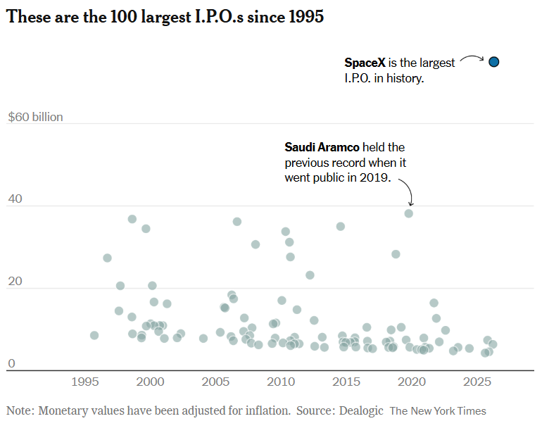
- The SpaceX IPO was the largest in history, with $75 billion raised and no other offering in the historical comparison exceeding $40 billion.
- SpaceX began trading after being priced at $135 per share, opening around $150, trading as high as roughly $176 and closing its first day near $161, with first‑day volume of approximately 517 million shares versus 555 million shares sold in the IPO.
- SpaceX’s first‑day market value of about $2.3 trillion places it among a growing list of U.S. companies above $1 trillion, alongside Berkshire Hathaway, Eli Lilly, Micron Technology, Tesla, Meta, Broadcom, Amazon, Microsoft, Apple, Alphabet and NVIDIA.
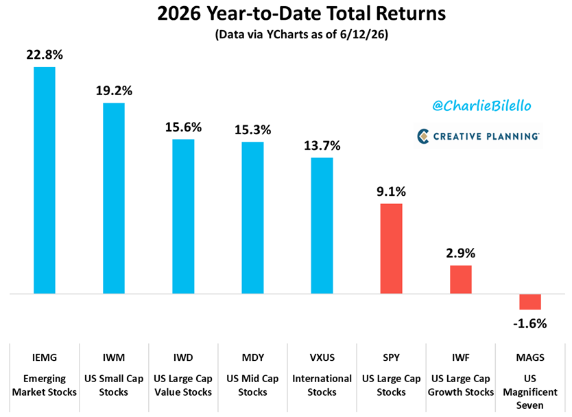
- 2026 year‑to‑date returns highlight an “everything reversal,” with emerging market stocks, U.S. small caps, U.S. large‑cap value, U.S. mid caps and international stocks all ahead of the S&P 500, while U.S. large cap growth lags and the Magnificent 7 ETF is slightly negative.
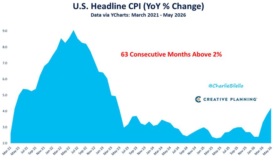
- Recent CPI data shows a 4.2% increase over the past year, the highest reading since April 2023, with categories such as electricity, apparel, transportation and medical care all contributing to the rise.
- Over the last five years, CPI has averaged about 4.5% per year for a cumulative increase of roughly 24%, remaining above the Fed’s 2% inflation target for 63 consecutive months, while producer prices have climbed about 4.7% per year over the last five years for a cumulative gain near 26%.
- Inflation currently runs at 4.2% versus an effective federal funds rate of around 3.62%, and prices are now about 14% higher than they would have been along a 2% path since 2020, implying average inflation of about 4.1% per year over that period.
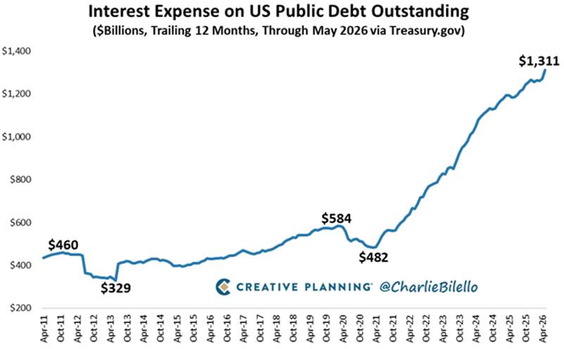
- May 2026 federal receipts are around $336 billion, outlays are near $628 billion and the monthly deficit is roughly $293 billion, with customs duties swinging from nearly $30 billion per month to slightly negative and 12‑month interest expense on U.S. public debt reaching about $1.3 trillion as total debt moves toward $40 trillion.
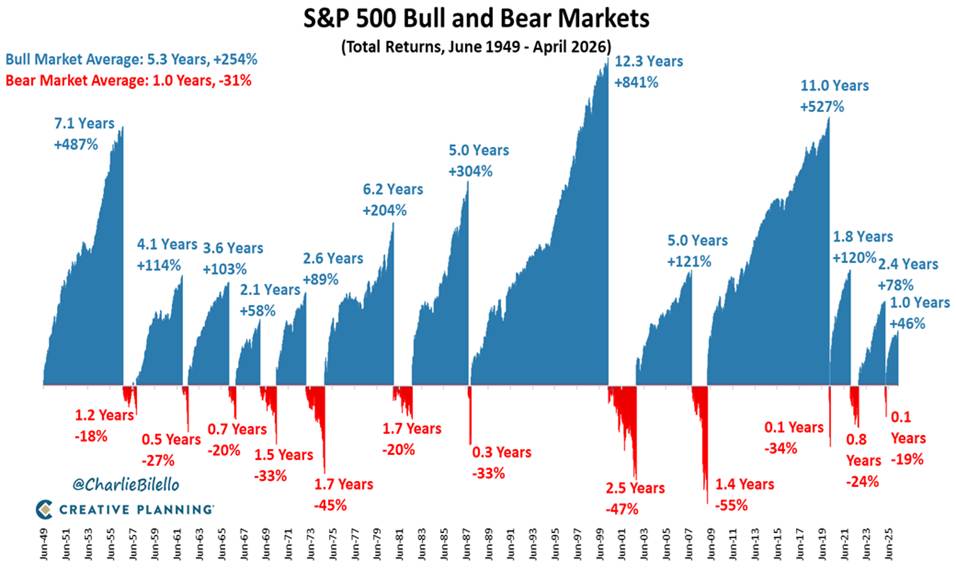
- Long‑term data indicates that the current U.S. expansion has lasted about 71 months versus a 67‑month post‑war average, and historically the average bull market has lasted just over five years with cumulative gains of roughly 254% while the average bear market has lasted about a year with an average decline around 31%; the latest bull market is more than 40% above its lows and more than a year old.
Structured Transcript Outline
Below is a structured, section‑by‑section outline of the episode with references to key charts. The full transcript appears below these headings on the episode page.
Introduction and this week’s big themes
The episode opens with an overview of the docket: the SpaceX IPO, tech dominance, the “everything reversal,” inflation and prosperity, Fed policy, U.S. government spending, the Iran conflict and a closing look at long‑term market and economic history.
SpaceX IPO sets a new record
The first segment focuses on SpaceX and the sheer scale of its public debut. A chart of the 100 largest IPOs since 1995, adjusted for inflation, shows SpaceX raising $75 billion, with no other IPO on the chart exceeding $40 billion. Another chart walks through first‑day trading: the IPO is priced at $135, opens near $150, moves as high as roughly $176 and closes the day around $161, with approximately 517 million shares traded versus 555 million shares sold in the offering.
Featured Chart 1: Largest IPO in History Scatterplot (1995-2026)
SpaceX shares, market cap and ETF inclusion
A market cap chart sets SpaceX alongside other U.S. companies with valuations above $1 trillion, showing SpaceX at about $2.3 trillion. The chart also includes Berkshire Hathaway, Eli Lilly, Micron Technology, Tesla, Meta, Broadcom, Amazon, Microsoft, Apple, Alphabet and NVIDIA, illustrating how many mega cap names now sit in the trillion‑dollar club. The episode then covers how index rules — such as profitability requirements, float‑adjusted weighting and minimum trading histories — affect when and how SpaceX might be added to S&P 500, Nasdaq 100 and total market ETFs and what its eventual weight could be.
IPO valuation, liquidity and historical risk
The IPO discussion continues with a chart on first‑day trading volume showing roughly 517 million SpaceX shares changing hands, with almost the entire 555 million shares sold in the IPO, emphasizing how quickly ownership turns over on day one. Another chart compares price‑to‑sales ratios across major tech and growth names, with SpaceX around 119x sales — well above other companies such as Palantir, NVIDIA, Tesla, Alphabet, Apple and Microsoft. A table of major IPOs over the past 15 years then summarizes how the median one‑year return after first close has been about −31%, with a median maximum drawdown around −53%, underscoring how many large IPOs have eventually traded below their first‑day levels.
Tech dominance reaches another extreme
A long‑term chart of S&P 500 technology sector weighting since 1990 shows the tech sector now near 40% of the index, with the episode noting that this exceeds the prior March 2000 peak of about 35%. A second chart plotting the ratio of the S&P 500 tech sector to the overall S&P 500 shows a new all‑time high in June 2026, marking how much of index performance has been driven by tech stocks.
The everything reversal across equity markets
A “2026 Year‑to‑Date Total Returns” chart compares performance across emerging market stocks, U.S. small caps, U.S. large cap value, U.S. mid caps, international stocks, the S&P 500, U.S. large cap growth and the Magnificent 7 ETF. The chart shows emerging markets, small caps, large cap value, mid caps and international stocks ahead of the S&P 500, while U.S. large cap growth is up less, and the Magnificent 7 ETF is slightly negative year‑to‑date. This pattern illustrates the “everything reversal” underway beneath the surface of the headline tech narrative.
Featured Chart 2: 2026 year‑to‑date total returns across major equity segments.
Inflation data and the decline in prosperity
The inflation segment reviews the latest CPI report for May. CPI is up 4.2% over the past year, described as the highest reading since April 2023. A category breakdown chart highlights key contributors, with electricity up about 6% year‑over‑year, apparel around 4.8%, transportation near 4.1% and medical care around 3.6%, while used cars are the only major category shown declining over the year.
A longer‑term CPI chart shows that over the last five years, prices have risen at an average pace of roughly 4.5% per year, for a cumulative increase of about 24%, and that CPI has been above the Fed’s 2% inflation target for 63 consecutive months — more than five straight years. A separate chart comparing cumulative price increases to wage growth indicates that inflation has once again outpaced wages in recent months, putting real wage growth back into negative territory and reducing households’ room for discretionary spending and saving.
Featured chart 3 (The core problem): U.S. headline CPI YoY % change — 63 consecutive months above 2%
Why the Fed may be behind the curve
A policy chart compares the latest 4.2% CPI reading with the effective federal funds rate of around 3.62%, highlighting that inflation is running above the short‑term policy rate. Another chart shows cumulative CPI since the start of 2020, indicating that prices are now about 14% higher than they would have been had inflation followed a 2% annual path, which corresponds to realized inflation averaging about 4.1% per year over that period.
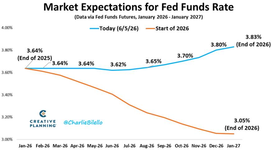
The episode also reviews producer price data. Over the last five years, producer prices have risen about 4.7% per year, for a cumulative increase of roughly 26%, with the most recent PPI reading described as the highest since November 2022. A market‑implied rates chart shows how expectations for the federal funds rate have shifted since the beginning of 2026, from multiple anticipated cuts toward a path that includes at least one additional hike before year‑end. A global inflation and rates chart then notes that the European Central Bank has already hiked rates by 25 basis points and that central banks in Denmark, Norway and Australia have also moved, with expectations of further action from the Bank of England and Bank of Japan.
Featured chart 4 (The macro shift): Fed funds rate expectations — start of 2026 vs. now
Government spending, deficits and debt pressure
The fiscal section examines the U.S. federal government’s May 2026 budget numbers. Charts show receipts of about $336 billion, outlays of around $628 billion and a resulting monthly deficit of roughly $293 billion. Customs duties, which had been contributing close to $30 billion per month, are shown turning slightly negative due to tariff refunds following a Supreme Court ruling.
A separate chart tracks interest expense on U.S. public debt over the trailing 12 months, with the total around $1.3 trillion — more than double the level from a few years earlier — and notes that if this growth continues, interest could become the largest single line item in the federal budget. The episode also highlights that overall U.S. debt is moving toward about $40 trillion, and that even if interest rates stay where they are — let alone rise — this combination implies a growing share of federal resources devoted to debt service.
Featured Chart 5: Interest expense on U.S. public debt, rising to roughly $1.3 trillion over the latest 12‑month period.
Iran headlines and market reactions
The geopolitical segment summarizes recurring headlines related to the Iran conflict. The episode notes that there have been more than 30 public statements suggesting a deal was near followed by reversals, creating a pattern of “another day, another deal.” Markets have tended to respond to deal‑related headlines with rising equity prices and falling crude oil prices, and one view discussed is that crude oil prices may be lower than fundamentals alone would suggest because traders are wary of being long crude when the next deal announcement hits.
Why good times still outweigh bad times
The closing segment looks at long‑term economic and market history. A chart of U.S. expansions shows the current expansion, which began after the 2020 COVID recession, has reached 71 months, compared with a post‑World War II average expansion length of 67 months, while the average recession has lasted about a year. A companion chart on bull and bear markets displays an average bull market lasting just over five years with cumulative S&P 500 gains of around 254% and an average bear market lasting about one year with an average decline of around 31%.
A final chart shows the current bull market, which followed the 2025 tariff‑driven bear market, more than 40% above its prior lows and already more than a year old. Together, these charts underscore that, historically, structural expansions and bull markets have lasted much longer and delivered much larger gains than the typical recession or bear market decline.
Featured chart 6 (The silver lining): S&P 500 bull and bear markets — total returns and duration
Further Reading and Resources
- Private credit and IPO activity: For a deeper exploration of speculative issuance and modern risk appetite, listen to Hot Money: Private Credit and the IPO Frenzy.
- Macro and inflation perspective: For more on inflation, rates and long‑term returns, explore Jeremy Siegel: Stocks, Inflation and America’s Future.
- Geopolitics and portfolios: To understand how regional conflict can affect markets, see What Does Conflict With Iran Mean for Investors?
- Ongoing chart updates: Catch every new episode and chart breakdown on The Week in Charts, or browse broader commentary in the Insights hub.
